In today's fast-paced world, where digital solutions play an integral role in our daily routines, designing an app that simplifies essential tasks can have a meaningful impact. One such task, often overlooked is plant care—vital for the health and growth of plants. Recognizing the value of simple and effective solutions, I designed an app that not only solves this common challenge but also educates users on plant care, making daily maintenance both effortless and enjoyable.
Challenge
Plant enthusiasts, whether beginners or seasoned gardeners, often face difficulties in managing plant care due to a lack of knowledge, time constraints, and the need for a reliable source of information. Existing solutions have either been too complex or failed to provide a holistic approach to plant care, leaving users juggling multiple apps and sources for plant identification, care reminders, and problem diagnosis.
Outcome
A comprehensive mobile app that simplifies plant care by integrating identification, reminders, and problem diagnosis into one intuitive platform.
Role
Independently designed the application from ideation and research to a fully functional user-centric flow, handling all aspects of UI, UX, and branding, as part of the 10kdesigners cohort.
Academic Project
Product Design
Lifestyle
2023

Nourish aims to be a digital companion that supports users in nurturing their plants, making plant care both accessible and enjoyable.
Discovery and Research
The discovery phase involved comprehensive user research, where I conducted interviews with both beginner and experienced plant enthusiasts to understand their habits, challenges, and needs in a plant care solution.
Through market research and competitive analysis, I identified key gaps in existing apps, such as the lack of holistic care approaches and overly complex interfaces. Key findings included users frequently forgetting to water plants, struggling with plant health diagnosis, and desiring personalized advice tailored to specific plant types and environments.
Using these research insights, I began mapping out the app’s architecture and user flow, aiming to create an intuitive experience where users could effortlessly navigate between features. Low-fidelity wireframes were then created to visualize the app’s flow and refine the design.
Design and User Experience
With a solid understanding of user needs and a refined structure, the next step was to craft the app’s visual identity. The aim was to create a design that not only looked appealing but also resonated emotionally with users.
The app incorporates earthy green and orange tones, with green symbolizing growth and health, while orange serves as a vibrant contrast for call-to-action buttons. The SF Pro Display typeface was chosen for its readability, and the text hierarchy is carefully designed with varying font weights and sizes to guide users smoothly through the content.
Soft, rounded buttons and light, neutral backgrounds contribute to a calming interface. Positive feedback mechanisms, such as congratulatory messages, badges, and achievements, foster a sense of accomplishment and encourage continued use, which is crucial for maintaining engagement in a hobbyist app.
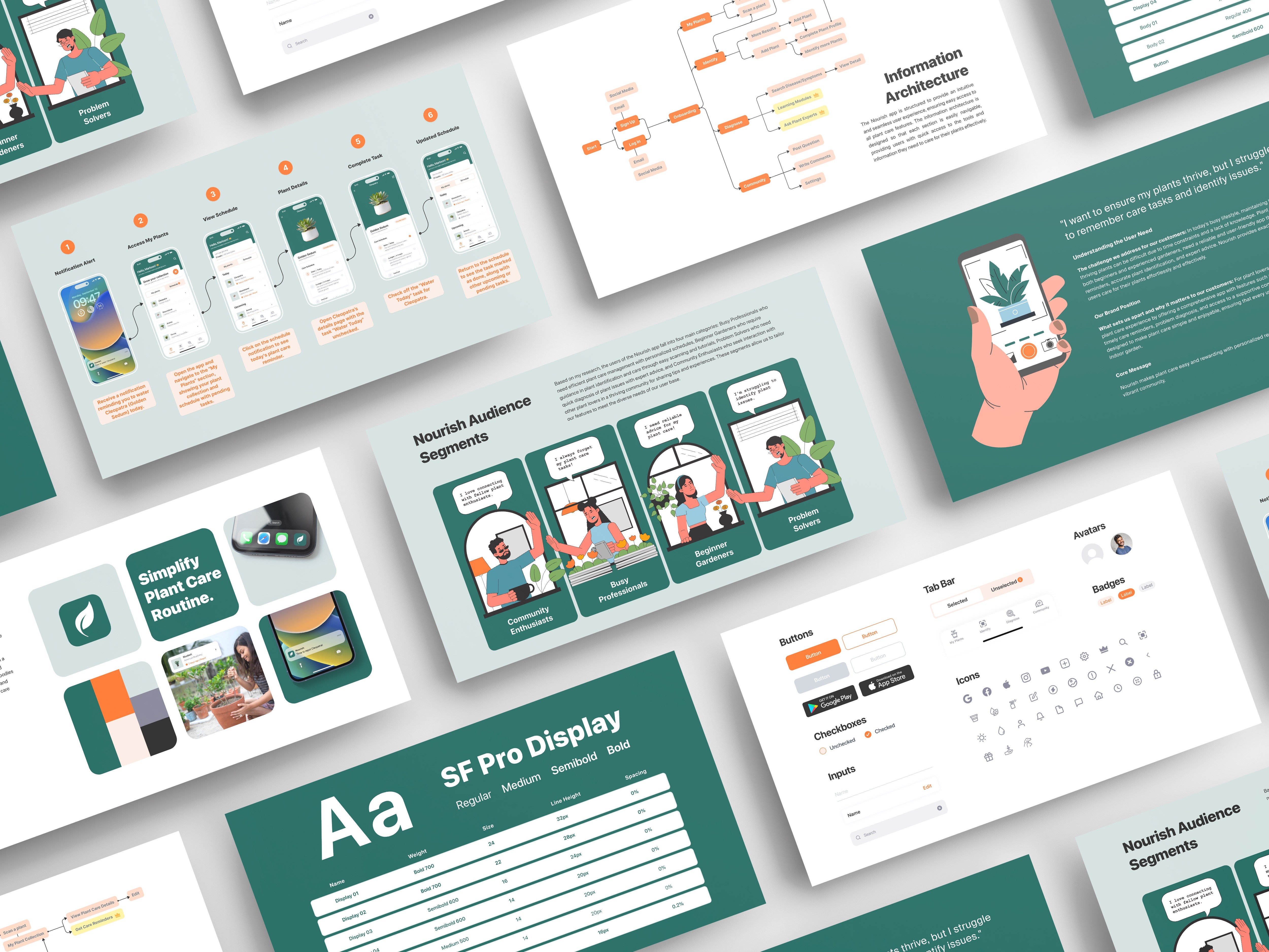

Developing the sitemap for Nourish offered a comprehensive overview of the app's navigation and taxonomy, detailing the main functions and subfunctions, and integrating a layer of its premium features.