Challenge
The Wise Yogi Co., a brand devoted to promoting sustainable living and holistic wellness, aimed to create a visual identity that would resonate with its audience while embodying the principles of balance and mindfulness. The challenge was to develop a cohesive brand identity that could be consistently applied across various platforms, including product packaging, digital presence, and a coaching app.
Outcome
The collaboration resulted in a distinct and unified brand identity that effectively captured the essence of The Wise Yogi Co. The logo, colour scheme, typography, and visual elements were carefully curated to reflect the brand's commitment to holistic living.
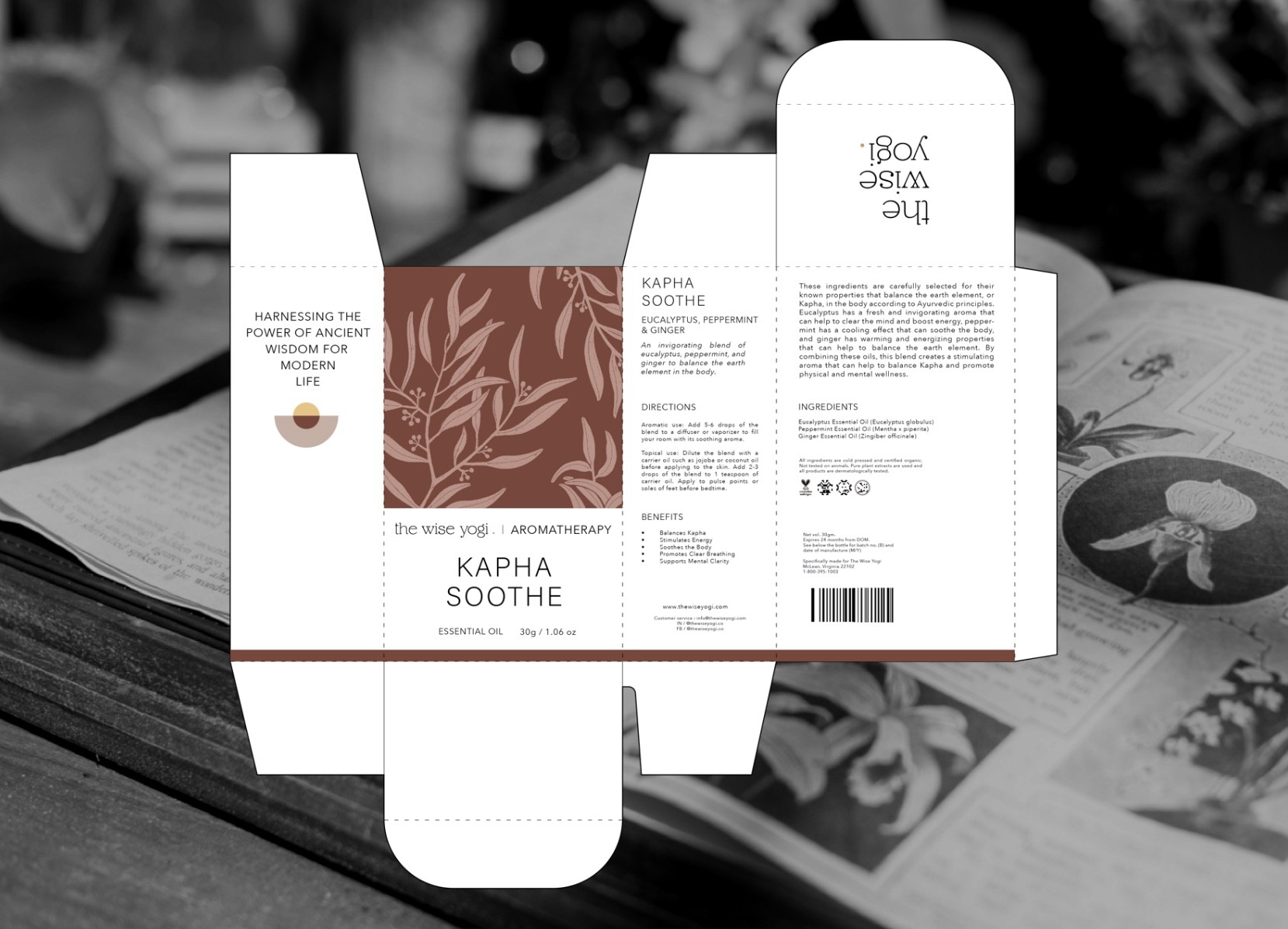
The branding extended to the packaging design for The Wise Yogi’s essential oil products, which featured a clean, minimalistic design inspired by the brand's values of ancient wisdom, natural healing, and mindfulness. This cohesive look not only enhanced the brand’s visibility on shelves but also reinforced its message of sustainable and balanced living.
My Role & Team Collaboration
As the lead graphic and creative designer, the role involved developing a comprehensive brand identity and designing key visual elements for The Wise Yogi Co. Close collaboration with the brand’s founder ensured that the visual language aligned with the core values of balance and wellness.
The work included creating a distinctive logo, including an animated version for digital platforms, and developing packaging designs that mirrored the brand’s philosophy. The ongoing collaboration continues with projects focused on expanding the brand’s visual identity to new product lines and digital interfaces.
Shashank N
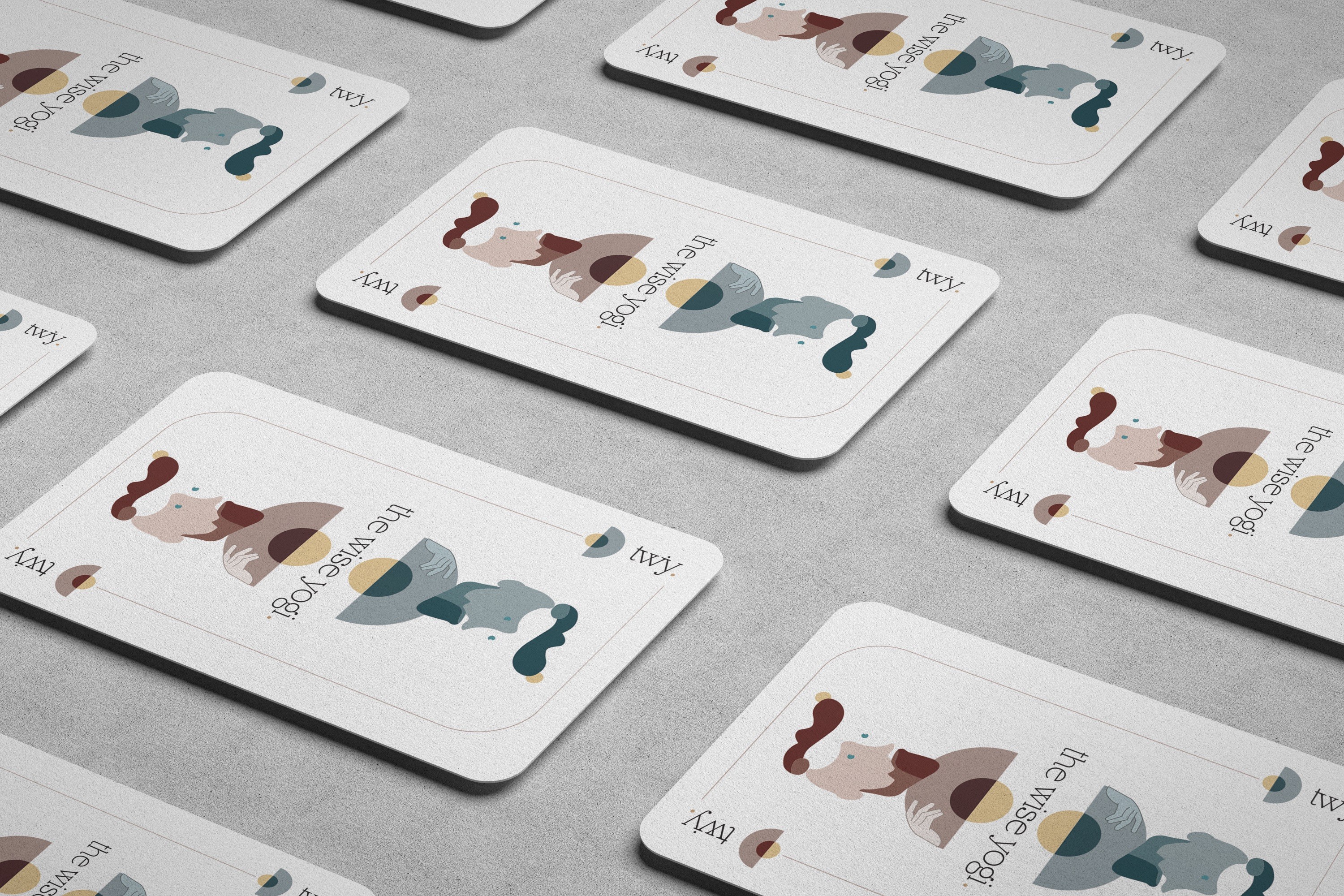
Brand Identity
Wellness
2021

The design approach focused on creating a harmonious blend of modern aesthetics and timeless principles of holistic wellness.
The logo, featuring a design reflective of ancient wisdom and natural healing, was complemented by an animated version for digital platforms.
The chosen fonts and colour palette were selected to balance modernity with timelessness, creating a visual language that supported the brand’s core values. Calming hues and natural tones were employed to enhance the sense of tranquillity and coherence across all branding materials.
For the essential oil packaging, natural imagery and calming colours were used to create a sense of relaxation, ensuring the products stood out on the shelves while remaining true to the brand’s identity and being both visually appealing and informative.

A key learning from the project is that ensuring the visual identity remains relevant and resonates with the audience while staying true to the brand’s foundational concepts is essential for creating a lasting and impactful brand presence.